
My friend and fellow author Keanan Brand is nearing the publication of his new fantasy novel, Dragon’s Rook. In June, I saw this post on his Adventures In Fiction blog: “Wanted: Cover Artist.”
When Keanan asked me if I’d draw the cover art for his book, I accepted the job and felt honored to be chosen for the work. As a child the public library was my playground of choice and I suspect that deep down it has always been my dream to be a cover artist!
But there was a problem. I was trying to break into the design world via my Bamboo tablet (a graduation gift). I’d already faced the challenge of learning to draw on a flat surface while looking at the laptop screen to see where my stylus was pointing. How I wished I had a tablet with a screen as I struggled to get my hand-eye coordination right! For an artist used to drawing on paper, it was certainly my first hurdle to overcome.
Practice improved my skills, and I felt ready to try a larger project.
The Original Vision:
Keanan’s vision for the cover of Dragon’s Rook was a detailed drawing–
“Art involving a dragon eye, a massive claw gripping a pile of rubble, one wing wrapping the side and bottom of a crumbling stone tower, and maybe shadowy shapes in the dark distance. A cover that will still look good as a thumbnail image.”
My Vision:
Though I searched online for images to inspire the work, I felt drawn to the idea of a circle in the middle of the book cover. A single dragon eye, like the picture Keanan had posted on his blog. We talked about it, and Keanan liked the idea. It almost seemed to pay homage to a hardbound book he recalled from the Lord of the Rings trilogy.
The Eye of Sauron. The eye of the Dragon King.
We decided that a castle tower would be reflected in the pupil.
A simple and thought-provoking image, telling a tale, inviting the reader to open the book. Or in this case to purchase it for their e-reader, since Dragon’s Rook will be published electronically first.
Evolving Images:
My initial offering was a rather menacing eye, but still not detailed enough to catch the reader’s attention as a thumbnail image. You can see this below.

I also had a few hiccups along the way, including one image that looked a little bit like an olive. “Dragon’s Cook?”
 Finally the image began to look more like something we both felt was getting close to the vision.
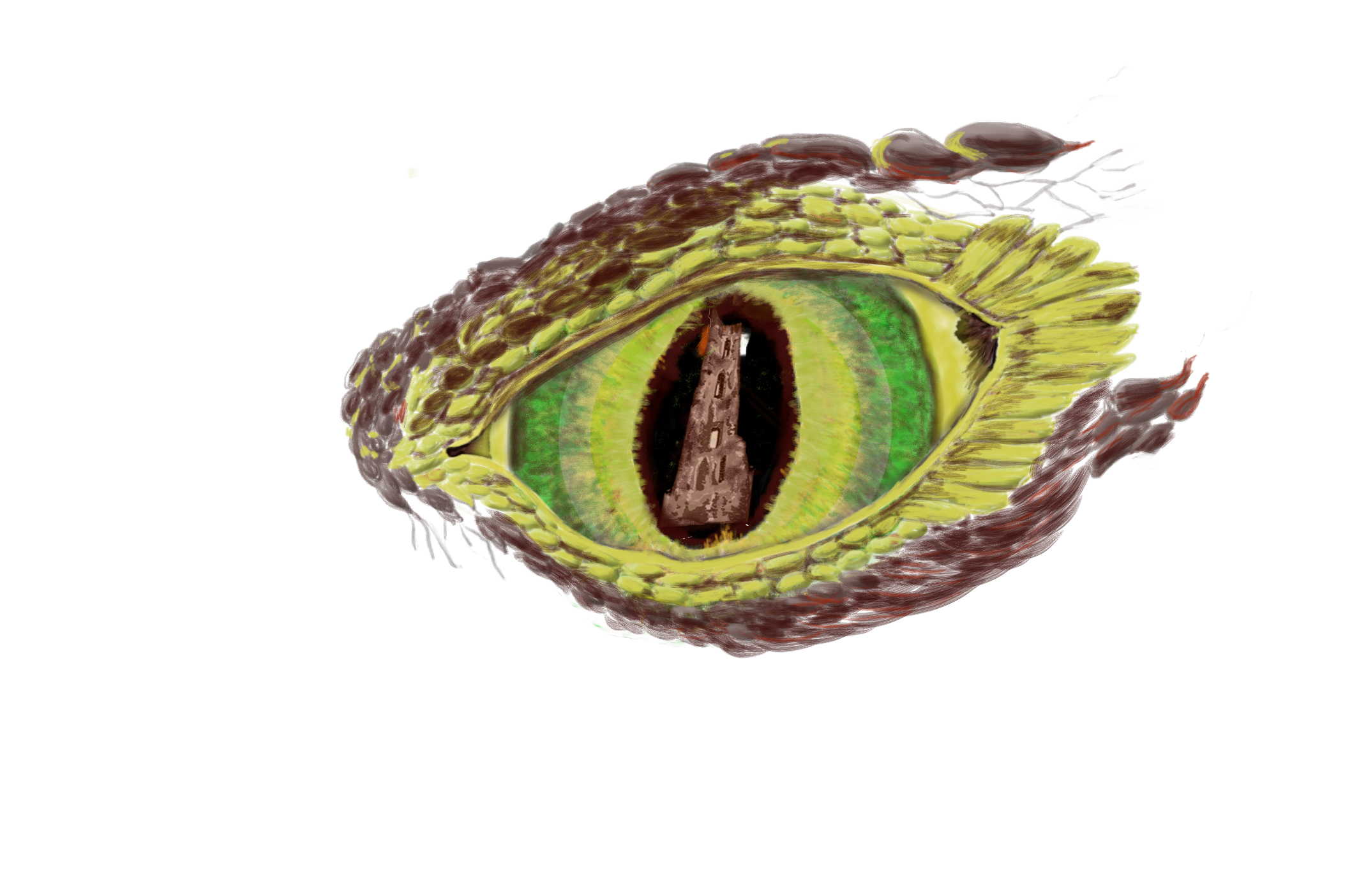
I wanted to add smoke and fire, but felt it would complicate the image too much. Keanan suggested creating a white for the eye rather than using the yellow background for the iris. I also wanted to add wrinkles to indicate the creature’s age.
I decided to build up the scales with the bevel effect with the Bamboo oil and dry brush tools. The scales reminded me of cobblestones. The bevel effect made them pop with an almost 3D-style!
The details faded as the viewer got further from the center of the eye. Like a tornado, the swirling scales pulled a sharper focus toward what the dragon was viewing.
The Final Image in Progress:

We felt that our vision for the cover was simple, intriguing, and menacing!
Future Plans:
We plan to use a very similar style for the Dragon’s Bane cover. This is the next book in the series, and it will feature the eye of a different dragon character, with a sword instead of a castle tower in the iris of the eye. This image is not shown at full size, but should give a good idea of our design plans for the book.
Feedback on this design is greatly appreciated as we finalize the project!
-Suzan Troutt, artist and author, art copyright 2014-
